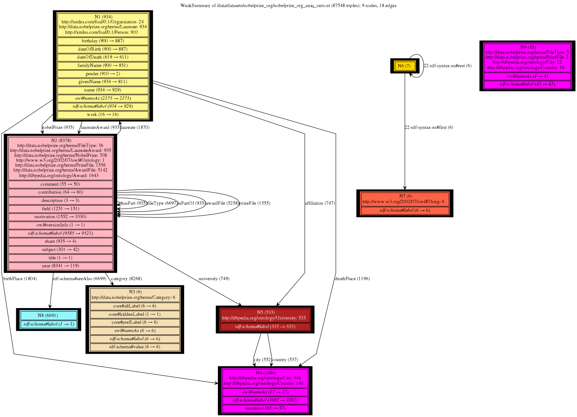
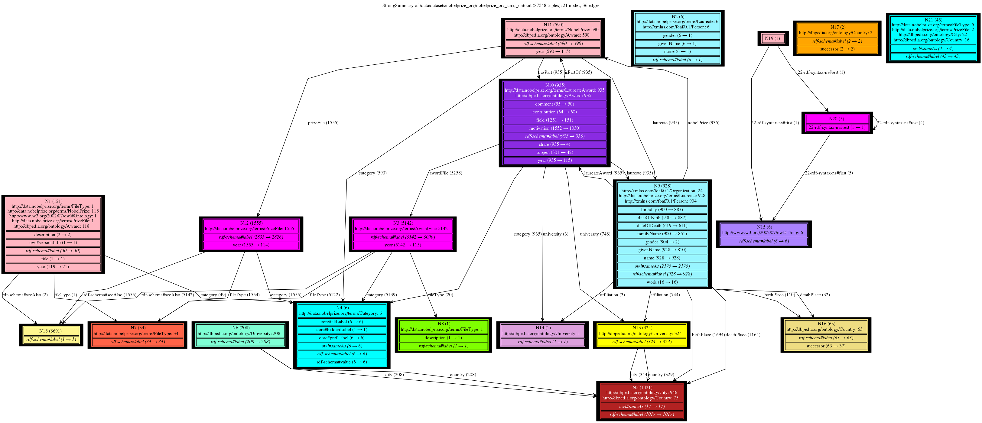
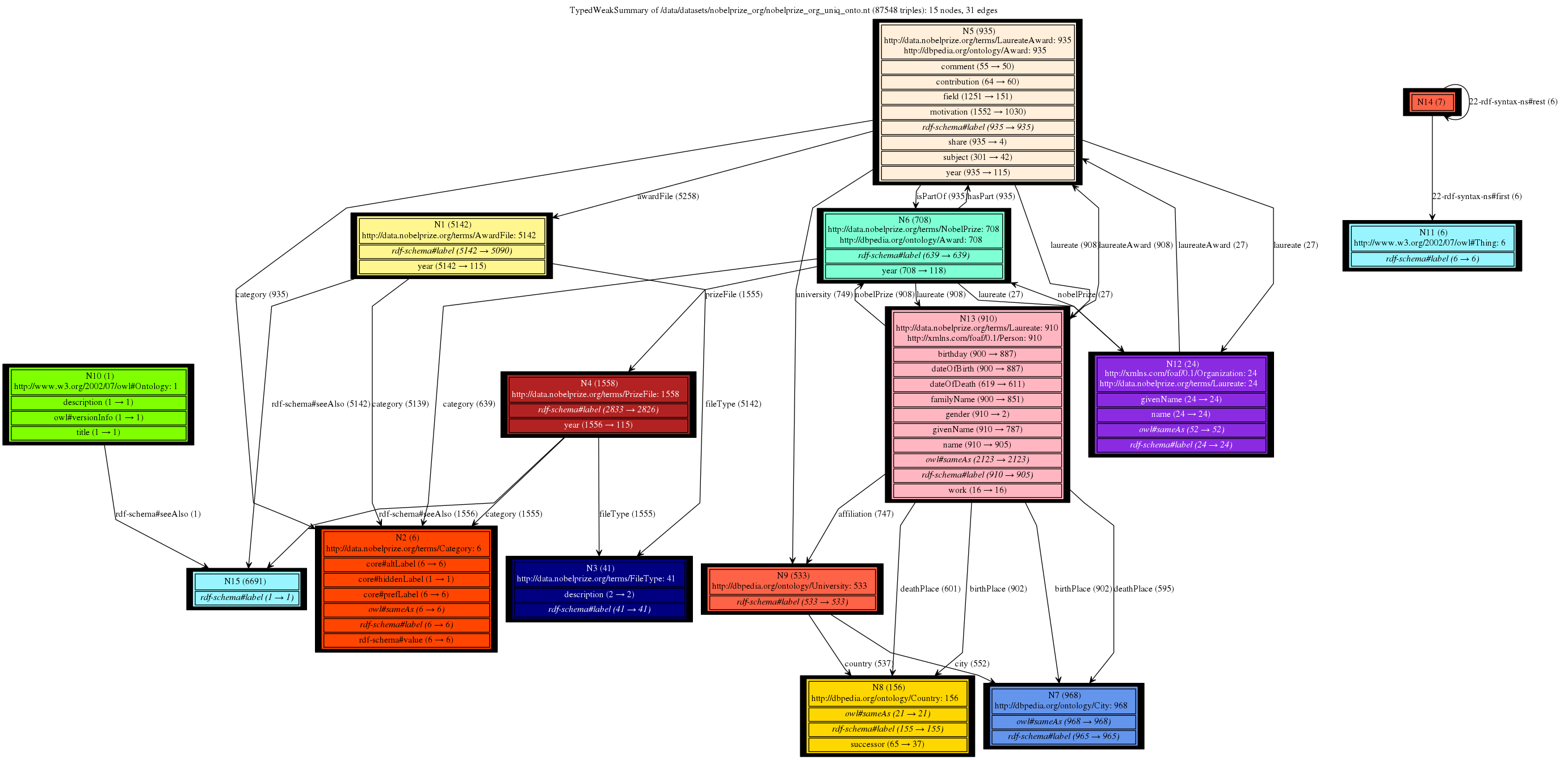
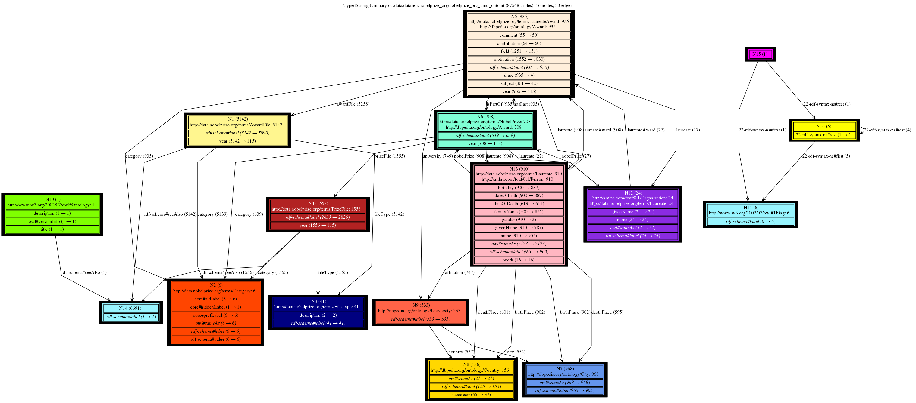
This is a gallery of Nobel Prizes dataset (not saturated), available here: data and ontology. It gives a great intuition of the trade-offs between type handling approaches and the granularity of the summary nodes depending on the chosen notion of equivalence (Weak, Strong or forward, backward similarity). We can clearly see that all our 4 summaries provide compact and readable graphs with different sizes and serving different purposes. Conversely, the summaries based on bisimulation techniques fail to provide any insights, being overly complex.