


RDFQuotient: What’s in an RDF graph?
RDF graphs can be large and heterogeneous, making it hard for users to get acquainted with a new graph and understand whether it may have interesting information.
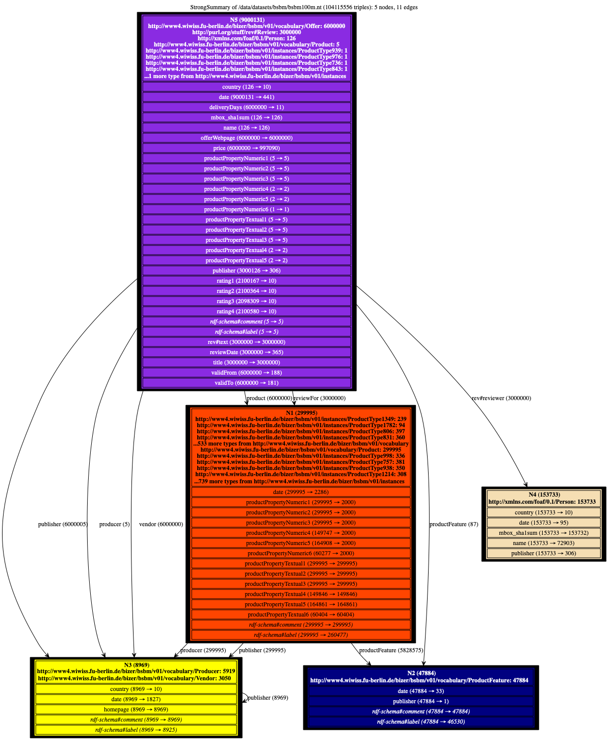
To help users figure it out, we have devised novel equivalence relations among RDF nodes, capable of recognizing them as equivalent (and thus, summarize them together) despite the heterogeneity often exhibited by their incoming and outgoing node properties. From these relations, we derive four novel summaries, called Weak, Strong, Typed Weak and Typed Strong, and show how to obtain from them compact and enticing visualizations. Here is the Strong summary of a BSBM benchmark graph of 100 million triples (not saturated), automatically built by our software (click on the icon to get the full-scale image, or here for a detailed explanation):
Teaser talk video
A short video introducing concepts of RDFQuotient presented at VLDB 2020 is available here.
Summary visualization gallery
Below, each link leads to a page where we plot several summaries: ours and those computed through bisimulation-inspired methods. When the latter is absent, they had thousands of edges, and the drawing failed.
Enjoy our gallery of examples!
- Tiny synthetic example illustrating summarization steps
- Small, regular dataset from the Open Data of the state of Connecticut, on abuse
- Berlin SPARQL Benchmark (BSBM) documents:
- Lehigh University Benchmark (LUBM) documents:
- A dataset on clean_energy
- Springer open data on conference publications
- More open data from the state of Connecticut ctgov
- A version of the dblp bibliographic dataset
- DBPedia Person data dbpedia_person
- Data on ENEL shops enelshops
- Data about food, recipes, ingredients, cooking instruments, and the like foodista
- Data from NASA nasa
- nobelprize.org
- watdiv100m
Download
The project is written in Java and developed under Maven and Git. You can check it out at:
https://gitlab.inria.fr/cedar/RDFQuotient
Publications
When referring to this work, please cite the article published in The VLDB Journal.
- François Goasdoué, Paweł Guzewicz, Ioana Manolescu. RDF graph summarization for first-sight structure discovery (journal paper), The VLDB Journal, 2020.
- Paweł Guzewicz, Ioana Manolescu. Parallel Quotient Summarization of RDF Graphs (workshop paper), Semantic BigData 2019, Jun 2019, Amsterdam, Netherlands.
- François Goasdoué, Paweł Guzewicz, Ioana Manolescu. Incremental structural summarization of RDF graphs (demo), EDBT 2019 – 22nd International Conference on Extending Database Technology, Mar 2019, Lisbon, Portugal.
- Ioana Manolescu. Structural Summarization of Semantic Graphs (keynote), ESWC 2018, Heraklion, Crete.
- Paweł Guzewicz, Ioana Manolescu. Quotient RDF Summaries Based on Type Hierarchies (workshop paper), DESWeb’2018 – Data Engineering meets the Semantic Web Workshop, April 2018, Paris, France.
- Šejla Čebirić, François Goasdoué, Ioana Manolescu. A framework for efficient representative summarization of RDF graphs (poster), International Semantic Web Conference, October 2017, Vienna, Austria.
- Šejla Čebirić, François Goasdoué, Ioana Manolescu. Query-Oriented Summarization of RDF Graphs (demonstration), proceedings of the VLDB Endowment, pp. 2012-2015, August 2015, Kohala Coast, Hawaii, United States. 8 (12).
- Šejla Čebirić, François Goasdoué, Ioana Manolescu. Query-Oriented Summarization of RDF Graphs (“Work in Progress” short paper), 30th British International Conference on Databases, BICOD 2015, Edinburgh, UK, July 6-8, 2015, Proceedings, July 2015, Edinburgh, United Kingdom. pp.87–91.
Technical reports
- Šejla Čebirić, François Goasdoué, Paweł Guzewicz, Ioana Manolescu. Compact Summaries of Rich Heterogeneous Graphs, Inria Research Report (v6), June 2018.